

Sunday, December 25, 2011
A Seasonal Post
This one appeared in The New Yorker magazine, Winter, '94. I was with my late brother Keith in a Village cafe in mid-December. He introduced me as to the waiter as "a cartoonist for The New Yorker" though I had only a couple things published in the magazine then. A elegant old dame sitting a few tables away introduced herself and said to me, "I've always wanted to see Zeus hurling lightning bolts at Santa, saying 'Tis my season!'" I had another idea sketched-out that I was going to submit later in the morning, so as a complete crapshoot I did this the rough for this one in a cab uptown. The lowercase gods were with me then. These days I could use a favor from Jove, though I could do without the bloodletting, barbarism (Jerry Sandusky would have been a normative Roman), lack of plumbing and superstition. Happy Holidays To All!

Sunday, November 27, 2011
Thoughts About Weed
This strip was published in Heavy Metal when Mark Martin was the cartoon editor. Let’s see…66 minus 48 is 18. My long relationship with cannabis went through yet more twists and turns after this strip was done (in addition to the 48 minus 28 years prior) before I arrived to this irrevocable position to put it down for good. After a brief psychic and physical struggle for a season or two, I finally got past the yen to toke. I don’t want to miss a moment of real life! (continued under strip...)
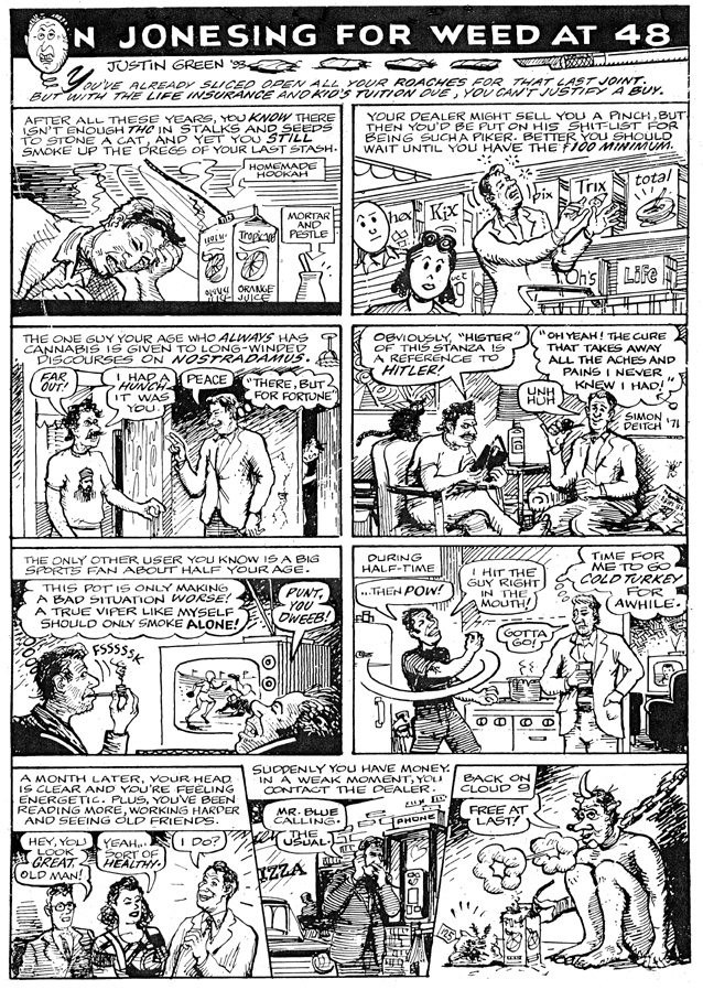
somebody refer to weed as “The Buddha.” It’s anything but. Cannabis Sativa (or Indica for the more jaded) is a cruel dominatrix who exacts a heavy toll for all the so-called gifts she bestows.
somebody refer to weed as “The Buddha.” It’s anything but. Cannabis Sativa (or Indica for the more jaded) is a cruel dominatrix who exacts a heavy toll for all the so-called gifts she bestows.
These days, unless you’re growing it yourself, chances are high that the stuff has Mexican blood on it. I’m also not buying the concept that this addictive drug is an herb—the more often you get high, the more you want to stay that way and you’ll need stronger and more expensive shit to stay there, period. The health risks are tangible: increased susceptibility to oral and throat cancer; the spleen function is impaired; memory function is blighted; worst of all, if you are combining weed with tobacco use, your chances of contracting lung cancer are increased fourfold. Why do you think the cartoonist Dave Sheridan died in his mid ‘30s and the great Nat King Cole died in his mid ‘40s? “Medical” marijuana for anyone but the terminally ill? See final paragraph.
If you are an artist or musician and weed is part of your muse process, you won’t have the sustaining stamina needed for the long haul. If you smoke several times a day, get it down just once; if several times a week, then one day. If several times monthly, then make it weekly. Or go cold turkey, little sapling. Failing that, try the real Buddha. On the other hand, if you are one of those rare and lucky people who can take it or leave it and your sole source of attaining a pot high is through occasional joints at parties or gifts from friends, more power to you. Still, beware. Few people who are able to truly appreciate a marijuana high can leave it alone for long. That smoky plateau is an egocentric, selfish state of mind that makes you less empathetic to your loved ones, though you keep trying to tell yourself that it’s bringing you closer. What little comforts are you denying them for the continuation of your expensive and stinking habit?
It also makes you vulnerable, dulling the adrenaline you need for sheer survival. You must be able to trust your intuition at all times. Wake up! You still have the rest of your life to muddle through, knowing that you’re closer to a clarity and inner peace far more beautiful than all of those pipe dreams could ever have provided.
Despite all of the above, I’m for legalization—if only to stop the violence in Mexico and the end of this disgusting “Medical Marijuana” movement. I don’t want to see anybody behind bars for dealing or using. The heavy toll on the individual and society by perfectly legal alcohol is far more serious. On the other hand, buzzed driving is drunk driving—and mandatory blood/saliva tests should be taken at all accident sites. There, I have spoken.
Monday, October 24, 2011
An Offer You Can't Refuse

Like many who suddenly become Seniors, I turn to the great literature and movies of my youth as reference points to gain a better foothold on this shifting dirt of mortality. To note the passing of an earlier age I hereby conjure up the voice of Upton Sinclair in his 1909 muckraking classic “The Jungle.” And why not? The internet is a vast Babel where History is yours for the ransacking. You, too, can be another pulsing frequency with a few deft mouse clicks.
In addition to the heartrending and thoroughly accurate accounts of slaughterhouse working conditions informed from undercover experience, Sinclair describes how economic blight and deprivation impact cultural standards. Within the immigrant Polish community in which many Chicago meat workers lived there was an Old World tradition that wedding guests compensated newlyweds for their lavish feast with gifts of money or high value items. Yet in America many invited revelers were living on the brink of survival, so the wedding banquet was only a temporary reprieve from starvation. These destitute guests had neither the means nor the inclination to contribute anything besides big appetites to the celebration. After the feast, before the customary time for toasts and presentation of gifts, some disreputable diners would exit out the banquet hall windows and jump to the street below. The hapless bride and groom would be ruined even before their first wedding night.
Bear with me. The drawing you see above was sent to Michael Wilde in ’96 (thanks to him for taking a digital shot recently). Not so long ago it was common for artists to embellish their letters and envelopes with quick sketches and doodles. Of course, correspondence has changed for the obvious reasons—the immediacy of the phone, social networking and email has made the slower exchange of ideas seem quaint. Yet these modern modes prod like alarm clocks. A well-conceived piece of writing demands rumination. There is an assumption that failure to respond immediately is some kind of lapse. But some ideas and emotions need to be absorbed before they are met in a worthy response. Part of the writing process entails showering these received ideas with attention and letting the field of present experience gradually illuminate them. Doodling and sketching are a way to get in the writing zone, or to compliment words that have been set down--and a well designed envelope is always a pleasure to receive. Some artists, most notably S. Clay Wilson, use embellished correspondence as a warm-up exercise.
Back to “The Jungle.” Though we aren’t (yet) reduced to handling cattle carcasses, most of us are struggling just to stay afloat. There are few, if any, positive predictions on the shape of things to come in the world economy. As an Icelandic wag remarked after the crash of Nokia, “We are all turning to porridge.” To step outside of the survival realm and to pretend that we are men of ideas with an innate need to communicate at the soul level is a neat trick for a cash-strapped man to perform. So when a friend or reader takes the time to imbue life with meaning via a personal contact—a feast that is shared with no other--it’s not uncommon for the recipient of that gift to jump out of the window like a sneaky Stockyards wedding guest by firing off a breezy email or simply not responding at all. Whether this is a personal failure or a savvy way to stay alive is not my judgment call to make. Only a wedding-leaper knows his true motives. But the lapse in substantive response is definitely a trend—and Facebook, tweeting, blogging, etc. don’t qualify as earnest personal communication. The obvious virtues of these social media are speed, mass replication and glitzy form; content is still dependent on old-fashioned individual consciousness.
Re: the drawing above. This is apparently a non-negotiable deal. Once you’ve made that bargain, it’s Tip-Taps, No Trade-Backs. But if I could somehow do it again, I’d exchange my Immortal Soul for Eternal Peace.
Tuesday, September 27, 2011
Thanx And A Tip O' The Hat to Jimmy Hatlo
Cartoonist Jimmy Hatlo’s prolific output spanned over four decades. He is known mostly for “There Oughta Be A Law,” a single panel syndicated strip which ran from 1929 until his death in 1963. His densely drawn imagery and highly nuanced writing thrived at the generous scale at which newspaper comics were then printed. Reading Hatlo is also a fascinating study to the forgotten American social conventions, fads and fashions.


Scroll under images to continue article...


His subject matter covered a breadth of topics unparalleled in the field (okay, maybe Ripley ran a close second but he wasn’t funny) because he solicited ideas from his millions of readers. It now seems quaint that the names and actual addresses of contributors were printed with each strip. That was before the era of financial institutions and/or sociopaths benefiting from knowledge of one’s personal information. Readers from every walk of life shared their unique insights about the foibles of humanity via the concrete details of those trades and disciplines in which they were steeped. He must have had quite a “morgue”. Before easy Internet fingertip access to any image, most professional cartoonists had filing cabinets full of photos and illustrations that could be summoned whenever the need arose. Any foreign object vital to conveying a gag idea would become uniquely Hatlo-ized, as if he effortlessly conjured it up with a few deft strokes. His pristine and often bold ink lines bring his subject matter to life with a directness and clarity.
As anyone who has attempted to draw a crowd scene in which specific details and objects need to be crystal-clear, can attest, this is not so easy to do! While the laws of perspective are generally obeyed, Hatlo is just as engaged in the two-dimensional arrangement of people and objects situated in specific landscapes or interiors. There is so much visual information to be conveyed—along with tightly packed word balloons—the overall composition is a daunting juggling act. But Hatlo always magically manages to pull this off. Background characters are not given short shrift as most cartoonists, even good ones, do. His drawing is so great we don’t think about it.
The masterfully lettered dialog balloons range in content from pithy to hilarious. They are mostly corollaries of the main punchline, though sometimes they’re superior. This lush verbiage could hold its own with cinematic script writing. But Hatlo had no pretensions to making higher art. He was a champion of the common man’s art form. Hatlo was an advocate for the underdog, always sympathizing with workers over their bosses and wives over husbands (with the occasional exception) and those who suffered at the expense of others’ pretensions or just plain bad luck. I have no doubt that you could score one of his old volumes for a song on Amazon. Any serious cartoonist needs to have a little Hatlo on his or her shelf. I was amazed to discover he also had a running script called "The Hatlo Inferno." Google the title and you'll find a modern version available. You may also remember the character Little Iodine. Once part of his stable of stock characters, she jumped out to her own showcase. No Shirley Temple, she, but smart as a whip.
There was an imitation of Hatlo’s “There Oughta Be A Law,” which ran in the Chicago Tribune called, “They’ll Do It Every Time,” by Al Fagaly and Harry Shorten. I am delighted that they attributed a cartoon to Yours Truly when I was 13, though it was not the one I sent in. Over “Thanks to Justin Green of Highland Park, Ill.” was a strip about a guy who never took the newspaper that was on top of the pile (“Thaddeus Bop wouldn’t dream of taking the one that’s on top!) May father was finally delighted by something that I had supposedly done, and mimeographed copies were sent to all the relatives and business contacts. It seems fitting that my cartooning career began with a lie. For almost 40 years, the common perception of me which I can’t seem to shake is that I'm "The Underground Cartoonist Justin Green who produced ‘Binky Brown Meets The Holy Virgin Mary.’” The work I’m doing now is my best work and Catholic Guilt is just one jar on my spice rack. It is such an irony that anything signed by me from the early ‘70s fetches roughly ten times the amount that my far more accomplished work does today. Only Hatlo could do justice to this inequity. “Justin Green turns the color of his name when he sees stuff he did as a kid fetching big bucks, while in his Golden Years he has to paint signs to stay afloat.” Yeah, that would make a great Hatlo panel.
Sunday, September 11, 2011
Please Visit My Other Cartoon Site
Earlier this year I launched a new site with my fellow penman Brian Hagen. You could beam us up at http://www.pengrenades com
This is the current post. If you click on my archives button there, you'll see my latest work.

This is the current post. If you click on my archives button there, you'll see my latest work.

Thursday, August 25, 2011
Early '90s Politics

This piece appeared in a Sacramento newspaper back when restaurants were dealing with the newly discovered health issue of toxic tobacco air by cordoning off Smoking Areas just a few yards away from where normal human beings dined. The cartoon may seem obvious by today’s standards, but back then it was a shot fired across the bow at pro-tobacco advocates who wanted a more civil discourse about their habit.
This cartoon is also time-warped for the use of Zip-A-Tone. Transparent sheets of dots in various weights created tones of gray. The #11 Xacto blade was wielded on the flimsy and finicky material to cut the elaborate shapes that were required. Though once the staple of most professional illustrators and cartoonists, this product (along with rub-down letters) became suddenly obsolete as the computer set the new standards of reproduction.
This artwork is now offered on Ebay, until 9/4 Here’s the link (to paste in browser with rubber cement):http://www.ebay.com/itm/250880685321?ssPageName=STRK:MESELX:IT&_trksid=p3984.m1555.l2649
Tuesday, August 9, 2011
Race With Rot

This was one of a dozen ideas that my sister Eve dictated to me off the top of her head, one morning in 1994. That notebooks is buried in my archives, but I remember a few other topic ideas by heart:
WHY BREAKFAST COOKS TEND TO BE SPEED FREAKS
THE KITCHEN AS HELL; THE RESTAURANT PROPER AS THEATER (and the class differences that prevail in both worlds)
THE HUMBLE GRILLED CHEESE SANDWICH AS PROOF OF A RESTAURANT’S COMPETENCE
THE MONUMENTAL PAIN-IN-THE-ASS OF PROVIDING FRENCH FRIES
Of course, all this and more has been since handled by Anthony Bourdaine in “Kitchen Confidential.” Not to detract from the maestro’s fame, but he writes with exactly the tone and language that Eve can muster at the drop of a hat—still—even after the chemo. I can’t help but wonder if he saw this piece, which appeared in a couple magazines prior to the publication of his book. It may seem like a small point, but it is indeed a sticking one. He, too, used that comical aside seen below, “CHEF, YOU WOULDN’T!?”
To see and download the entire piece at an enlarged scale, visit Google Docs.
https://docs.google.com/leaf?id=0B2BRVzLZ17DCZmEzNWYxYzItMzI2My00MDRmLTg1NGYtZGU3MzNkNjc5ZjA1&sort=name&layout=list&num=50
Eve also presaged David Sedaris’ languid Billie Holiday imitation (in his notorious Macy’s Christmas Elf sketch) by about 25 years. Back in the early ‘60s, she made up a little ditty which she could deliver with the saucy lilt of Lady Day:
DIS-EN-CHANT-MENT….CAN’T STAND ANYTHING.Thursday, July 28, 2011
Yet More Unsolicited Advice

This cartoon originally appeared in Signs Of The Times magazine. I have enhanced (i.e., tinkered around with) it using Photoshop. Until lately, I've avoided reckoning with this game-changing program. Now I think of it as the subtitle to Dr. Strangelove:
"How I Learned To Stop Worrying And Love The Bomb."
Saturday, July 9, 2011
7/25/11 S. Clay Wilson Turns 70
 If you are familiar with my work, you can probably spot a drawing by S. Clay Wilson from across a room. You have doubtless heard about his debilitating condition, the result of a catastrophic fall several years ago. There were hopeful signs of in the early weeks following his recovery from a coma. These days those signs are far and few in between days of constant maintenance and care by his devoted wife Lorraine Chamberlain in their S. F. apartment.
The mercurial, provocative, hilarious Mr. W is somewhere inside of the being who resembles him. An occasional flash of the eyes and hint of a smile belie the long silences and monosyllables. He no longer draws, but knows that he once did. It's on us to remind him of how great his work is and to affirm his presence here. Recognition of birthdays (especially his own!) is still one of his core beliefs. If you could send a card to him, Lorraine will patiently read it to him and explain the imagery. If you read this post after the all-important date, then maybe you could send a Christmas card. Or better yet, a Halloween card would touch his old demon's heart. You can also send donations at any time to:
S. CLAY WILSON S.N.T. (Special Needs Trust)
P.O. Box 14854
San Francisco, CA 94114
or through secure site:
http://www.sclaywilsontrust.com
I recently wrote about the importance of Wilson's work in the Afterword to the McSweeney's edition of Binky Brown Meets The Holy Virgin Mary, so I don't need permission to quote:
The very title of the work was a conscious nod to S. Clay Wilson. The word "meets" is in reference to Ruby and the Dykes Meet the Pirates. The active verb guarantees conflict, or reconciliation of opposites. The title of my book was a resolution writ large, to hasten confrontation with my yet-to-be-determined deepest fears. Though seldom lauded these days in the same sentence as Crumb, it was Wilson's feisty spirit that permeated many of the Underground titles, so devoid of the milk of human kindness.
Soon after meeting me, he dubbed me "Guilty Green." With his strong personality and penchant for the undiluted, if uncomfortable truth, Wilson constantly challenged my artistic pretensions, yet I managed to hold on to a few of them during our heated exchanges. He was/is consistently true to his unique vision, wielding his pen with astounding versatility, creating immoral panoramas with the devotion of a monk. He is also capable of producing very tender images. While other cartoonists had published pornographic images it was Wilson's transgressive scenarios that redefined the standard of what is "beyond the pale."
Sunday, June 26, 2011
An Old Piece Now Newsworthy
My "Sign Game" strip ran monthly in Signs of the Times Magazine from '86-'06. I experimented briefly with facial hair in '99 (as shown), but it only made me look disreputable. I'm thinking that this new campaign to scare smokers with vivid pack warnings might be a cash cow... if the USPO can print custom stamps, why couldn't smokers order custom warnings? Visit my store at http://www.pengrenades.com and order yours online.


Thursday, June 16, 2011
Excerpt from "The Dying Penman"

From the instant that a line or mark is inscribed on a blank surface, it becomes a work-in-progress. Whether it’s doomed from the start to wind up in oblivion or destined to become a work of art depends chiefly on three factors: inspiration, clarity of intention, and technique (or execution). In practice, these pillars of the creative process are inseparable and they will continually be discussed.
Most literature about pen and ink is concerned primarily with technique. In Zen parlance, that is “pointing the finger at the moon.” One’s true technique evolves from personal search and experimentation, not adulation of another artist’s style. I still browse any and all books on the subject, even if they seem overly technical, and I’ve never encountered one that didn’t have some unique pointers or morsels of wisdom. I strongly advise the beginner to start a library on the subject. It will never decrease in value; and you’ll find yourself returning to the volumes over the years if you persevere in the craft. Even if you’re honest enough to admit that not one has ever been read from cover-to-cover, you’ll still be rewarded with insights that you can immediately put to use. Decades may clarify the meaning of some passages, even as they reveal others to express only relative truths that can be improved upon by direct experience. But even at the risk of missing the mark, one who has spent a life in ink doesn’t shy from leaving words behind in that most indelible of fluids.
The great French artist Theodore Gericault said that a true artist should be able to draw a body hurtling from a burning building before it hits the ground. If the word “doodle” can be substituted for drawing, I agree. Even within the field of pen and ink, there are so many types of drawing that the term is almost meaningless. When reading this book, please note the context of the advice that I offer. What may be true for one kind of imagery or style is not necessarily true for another. There are always exceptions to every rule, and no relative truth about art is universal.
What is a virtue in a successful work may also be perceived as a limitation. An artist who excels at bold studies of athletes in motion may lack the light hand or tender empathy so necessary for drawing children. And speaking of sports— please disregard the idea that art is a competitive enterprise which should or will be acknowledged with trophies and public merit. Regardless of the auction value of any artist’s work, living or dead, there is no ultimate winner or “best artist.” People who keep the records, historians and critics, bring cultural and personal bias to bear. Forget consensus opinion, too. Art is not a democratic enterprise. If you get to make a living at something you love to do, you win, and that may be as good as it gets.
With all due respect to my publisher, the profit motive isn’t the primary force behind the production of this book. He and I bring this work to print at a critical time in history for the conscious penman (and even for books themselves). I am seeing what I regarded as a slowly evolving and time honored craft suddenly become eclipsed, corrupted—then, finally, subsumed by the new computer technology. This revolution has occurred in a mere generation, side-swiping every purview of hand craftsmanship, from medical illustration to architectural rendering. Even Helvetica tombstones are now popping up everywhere!
I have already lived through this debacle in another field—as a traditional sign painter. It took less than five years for the field to implode after the new vinyl letters were introduced in the mid ‘80s. I stubbornly clung to the craft, chasing jobs that involved pictorials and complicated logos; yet even this niche became dominated by the new dot matrix/digital printers by the early ‘90s. Though “sign writing,” a subcategory within the general field of sign painting, has been rendered obsolete, the training and discipline needed to become an adept greatly improved my pen work. Any time spent with letterforms immediately amplifies vision and co-ordination.
I returned by necessity to the pen for a livelihood in the early‘90s, never dreaming that its existence would be seriously threatened so soon afterwards. Basic and refined principles of pen drawing are being relegated to historical footnotes. I feel driven to describe the dynamic nature of this art form I’ve pursued all my life in the hope that those who would try to take seductive shortcuts will realize what they are overlooking. With the stark realization that I’m running out of seasons, comes another grim thought: if I don’t set down these thoughts at this critical time, an artist of lesser skill might undertake the work; or worse, an inker of greater skill who might use a technical manual primarily as a showcase for finished work, with text content as only a secondary concern. I have made an earnest attempt to combine the two, as I know by heart the many pitfalls and misconceptions that a beginner might encounter along the way. Before I had any professional training, I entered the field by stealth as an auto-didactic. This book is a gift of love being sent back to myself, over half a century ago…
Thursday, June 2, 2011
Assume Nothing

This is excerpted from the forthcoming title, "The Dying Penman," to be published by the See Sharp Press of Tuscon.
This is an exercise in direct inking. Whether you use a dip pen or brush, there is a weight and speed to your line drawing that is as unique as your signature. Even markers will show your natural style, though the expressive capability of a single-weight line doesn’t reflect the variations of pressure and speed—which are among the strongest components of fluid drawing.
All handwriting is imperfect. Even master calligraphers show slight deviation from idealized forms. That margin between perfection and your everyday natural fluid pen-stroke is called “tolerance.” It is a the heart of your personal style and despite all the new controlling powers of the computer, this imperfection should be accepted—even valued—more than hidden. There are notable exceptions, but usually a bold direct line shows the spirit of cartooning. As “Brevity is the soul of wit,” many of the great cartoonists and illustrators work swiftly and directly, trusting their first impulses. The more you rely on the computer’s white-out tool, your innate ability to make a pure and bold line is being compromised.
This exercise begins with a pencil drawing that is comprised of a couple dozen lines (not including shading marks) to complete. It should be clear and simple, yet not too finished. The idea is to use this drawing as a template for several quick inked versions. If you don’t have a light table, then tracing paper will do for the ink work.
If you aren’t yet comfortable with a dip pen, then use an ordinary cartridge loaded fountain pen rather than a ballpoint. Brush handling is covered in a separate chapter and its use here would not be the optimum place.
These drawings should be done as if the lines being inked are just familiar letterforms. If the temptation is still strong to make familiar symbols for hands, feet, facial features, etc., then simply turn the drawing upside down and proceed boldly. You’ll be amazed at unexpected surprises from working this way. Sometimes it takes a change of procedure to get liberated from a stylistic rut.
By the time you get to the third drawing, your confidence will be increased. Details that may have been conceptual challenges in the first version become increasingly easier to refine in subsequent versions. This is not to suggest that later versions are always improvements over earlier ones; there may be early successes that are difficult to duplicate later. The important thing is to be aware of staying in the present with the ink. See the light reflected in the wet ink; hear the pen; notice that the slightest difference in the way the holder is twirled affects the outcome of the line or mark.
A technical note: because you’ll be working on very thin paper for these drawings, an ultra pointed nib (such as a crowquill) is not recommended. Choose a wider flexible nib, which will make it easier to explore the expressive capabilities of drawing without getting bogged down in unnecessary detail work and constant dipping and cleaning. There are times when you’ll be called upon to achieve very fine details with the help of a magnifying glass. But, hopefully, that kind of work will be rare. This exercise encourages spontaneity, which adds flair to inking. Float like a butterfly (with a careful pencil drawing); sting like a bee (with punchy inking)!


Monday, May 23, 2011
Some Political Pieces


Tuesday, May 17, 2011
All The Wrong Places

"Looking For Love In All The Wrong Places," ink and watercolor, 12" x 10", 2003
Wednesday, May 11, 2011
Great Moments In Marketing
This short-lived series surveyed great American icons, successful ad campaigns and products. Though artistically sound and well-written (and edited), the sales department at Signs Of The Times magazine didn't regard it as being cost-effective. Scroll below for all three...


Monday, May 2, 2011

Sunday, April 24, 2011

Monday, April 18, 2011
This Actually Works

I made this discovery when I had a studio near a row of trash cans. Flies were constantly entering through the mail slot, causing serious damage to my attention span. I devised this method as a way to 86 them out of my space, as I regarded them to be "sentient beings." (They are truly formidable enemies, too.) Nickelodeon contracted this piece, and it later reappeared in their "best of" Ten Year Anniversary issue. In case you don't have a spare bike horn, you can use a plastic cup with an index card. Make sure you don't have any unframed watercolors on your walls, though.
Saturday, April 9, 2011
My Old Friend Paul

Visual Vacations was a postcard company maintained by Paul McGeHee (1950-1989). The entire line celebrated the old graphic convention of conveying greetings from various states with gigantic letters that housed pictorial elements apropos of the word they spelled. The states these cards referenced were from various mental and psychic conditions, not the original 48 associated with the souvenir genre. With his constant companion Woofy, he made several cross-country trips in his VW bus ("The Roving Doghouse") It was always a pleasure when he swung by my abode. He commissioned me and a few other artists to submit designs complimenting his own titles, which comprised most of the VV line. I was working on "Greetings From Limbo" when he died prematurely from too much exposure to the sun earlier in his carefree youth. I was there with him when he took his last breath.
Saturday, April 2, 2011
For The Sake Of Argument


This pen and ink illustration was done in the early ‘90s. It flowed off the pen on a lucky session at the drawing board--as if it came straight from the Astral Plane. The colorization below was done last week in several strenuous spurts at the computer. Granted, I am new to Photoshop, and an experienced hand could have done all my moves more quickly; but I believe that the scintillating effects, for all the effort they entailed, don’t enhance the original concept a great deal. It’s nice to have brilliant, translucent colors at one’s fingertips. But the “Zen” of pen and ink is down and dirty watercolor, done in colors far more subdued. Intuition, which is the driving motive of such playful and enjoyable work, seemed to be taking a back seat to computer technology. This new specimen is more illustration than cartoon, so the impact suffers. To paraphrase the old saying, “The soul of wit is brevity, i.e., simplicity of means. ”
Even my houseplants are telling me that the old must make way for the new. This brilliant palette has the look of modern graphics, just as the aesthetic I’m comfortable with has a diminishing audience. Luckily I have a friend who is going to teach me about “layers.” Moral: If you’re arguing with yourself, you can’t lose.
Saturday, March 26, 2011

Sunday, March 20, 2011
A Brief History of the Barber Pole

Watercolor & Ink, 12" x 18", Originally Published in Signs of the Times, ©Justin Green
Saturday, March 12, 2011
Peeling The Onion

After some half-hearted & assed attempts to get published at the highly esteemed venue, I finally had a spate of cartoon drawings appear in the early ‘90s. After the initial elation, I quickly came back down to earth. Perhaps an illusory barrier had finally been broken, but I was no happier than before. I had merely peeled a shard from the onion, and there were scores to go. Now rejection was even more painful than before.
Monday, March 7, 2011
Out of Season
 Ink and Watercolor, 4" x 12", 2006, from Signs Of The Times ©Justin Green
These fabulous pelts were forfeited by the original owners when they suddenly became out-of-season.
Saturday, February 26, 2011
The Thrill of Meat After WWII

Saturday, February 19, 2011
A Forgotten Genre
A Brief History Of Emblem Prints Under Image
 Emblem prints were the first posters produced by the new print technology. There had been popular woodcuts produced earlier which made facsimile art available to the masses. But these prints lacked the complexity and subtlety of the new art form. From the 15th Century on, there was a wide demand for complex and refined images and text. The prints could be religious, didactic, poetic or naturalistic. Often they were printed as folios that were thematic to entice collectors (and perhaps to elicit subscription front money).
Today the word “emblematic” is merely an adjective than an NPR reporter might use to describe an action or event that embodies a new zeitgeist. Yet some emblem images had “legs”. For Vermeer, among many other painters, to reference certain emblem prints in the background of a few interiors suggests that they had a timely cultural significance. Google EMBLEM NETHERLANDS (then EMBLEM….ITALY, GERMANY, ENGLAND, SPAIN, FRANCE) and you will be richly rewarded with hundreds of surprising and beautiful images. The basic components of an Emblem image are simple:
A title
A frame
An image
Some expository text
These building blocks have varying degrees of emphasis depending on the individual artist and country of origin, not necessarily in that order. The Italian prints I’ve seen tend to have the most elaborate borders. But I am a babe-in-the-woods when it comes to this wonderful, forgotten genre. If any readers take the trouble to Google the source countries, please share your discoveries with me…justin.inknib@gmail.com
This pen and ink drawing was done by me in late ’10, specifically for a show in Seattle titled, “Medieval Minds.” My use of central text is unusual because most emblem narrative occurred at bottom. Even more apostate is my use of satire.
Sunday, February 13, 2011
Love Profane

As my dear mother often said, “Fool’s names and fool’s faces are often seen in public places.”
Sunday, February 6, 2011
Former Sign Painters

Another promising sign painter who left his sable brushes for a musical instrument was the great jazz guitarist Tal Farlow (1921-1998). But he kept his hand in, occasionally painting signs for his own gigs even when he was well known (Coltrane once saw him perched on a fire escape just before a performance). Remembering the lean times, he probably wanted to have a skill he could depend on long after the fickle public turned a deaf ear. But the growing jazz audience never tired of Farlow’s innovative fret work, so he eventually stopped bringing his sign kit along to musical engagements. But after his great albums of the ‘50s, he returned to professional sign painting in Seabright, NJ. Then there’s Woody Guthrie… see “Bound For Glory.”
This strip originally appeared in Signs Of The Times magazine. That’s not my current email address…it’s justin.inknib@gmail.com.
Sunday, January 30, 2011
National Postcard Campaign

Idea for Nation-Wide Postcard Project
Just before Wall St. tanked I did this retro postcard as a pilot version for an entire series of State Postcards using their 2-letter designations. I’m now thinking that local artist-denizens familiar with the culture, attractions and quirks of each state would provide better insight than myself.
In addition to the design and execution of artwork, this idea would take a lot of research, networking, editing and writing (there also needs to be a verbal explanation of the imagery for each card).
Though it would probably be more a labor of love than financially rewarding, all participants would at least have a nice portfolio piece and a personal postcard to send to friends and family. I’m sending this one to you from The Bluegrass State, like a message in a virtual bottle: “Go ahead…take this idea and run with it.”
Monday, January 24, 2011

Tuesday, January 18, 2011

Wednesday, January 12, 2011

Subscribe to:
Posts (Atom)