

Friday, January 4, 2019
Sunday, June 14, 2015

Saturday, April 4, 2015
Pen Lettering vs. Drawing

Some artists are "luckier" than others in having a natural gift of visualization; but being able to draw is also a discipline that can be learned and refined over a lifetime. And under the broad heading of drawing, working with pen and ink might be more accurately described as a craft. It involves having a workmanlike attitude about proper use of tools and materials. Among brush letterers (a subgroup of pen letterers) the term "artist" is an insult. It means someone who is a dilettante and while able to produce facile results, doesn't understand the high standards of work produced though countless hours of applied practice.
True pen lettering is more like drawing than copying ideal forms. It is bold and direct; often done quickly, and never quite perfectly. The marks made by a lettering craftsman fall within a narrow range or "tolerance," or near perfection. The greater the mastery of the instrument, the less tolerance will be noticeable.
Though copying of other artists' work is no longer widely accepted as being a necessary part of art education, it is most definitely appropriate at an early or intermediate stage of training in lettering to copy ideal typographic forms. Each typeface has distinct features which may elude the eye until patient portraits are done. Viewing alphabets upside down is another way to discover unique properties. Even an alphabet as seemingly uniform and mechanical like Helvetica will yield many subtle surprises to the
 wide-awake student. Any time spent in this kind of study will yield immediate results in visual acuity and eye/hand coordination, skills which are so necessary for progress in pure drawing. Both drawing from letterforms and life require a constant exchange of seeing positive and negative shapes in juxtaposition.
The shapes within and around letters are called "counters," short for "counter space." Some prefer the term "negative space." Through the double vision of seeing both a stroke with its surrounding space one gains the ability to layout individual letters in a balanced way. This is the basic definition of "kerning." The most faithfully rendered letter will lose its appeal if it is not properly aligned with its adjacent neighbors. This is achieved through the balance and distribution of counters, regarding these shapes to be just as important as the defining strokes. Without going into the basics of lettering theory and design, this brief description is lettering discipline in a nutshell.
Whether drawing with a fine flexible point or a broad calligraphy pen, holding a pen for lettering involves a steady grip. Once guidelines are marked, most calligraphic alphabets are inked in a rhythmic way. Stroking marks at a similar pace imparts a uniform stroke. It's also important to have the same relationship of hand to pen throughout the production of the desired text. Of course, there is a subtle awareness of the entire hand while lettering single line inscriptions or larger bodies of text. But there is a greater awareness of the mechanics of wrist and forearm when lettering as opposed to the random activity of free drawing. A light lock-grip is used for most calligraphic styles. More often than not, the fingertips are pressed into service only when drawing or doing specialty alphabets. For example, when doing a fluid script the standard lettering grip is less constricted and closer to that of a free form drawing.
Is there an ideal was to hold a pen? I will close with this antique image from a type-high block, which shows the ideal relationship of fingers to pen handle. There is a reason for doing most pen work with the first two fingers and thumb, as it makes optimum use of the hand muscles for pushing the flexible nib to its most expressive capability. This orientation of fingers could serve both extremes of free-form artistic lines or the narrower range of muscle handling required for plain one-stroke lettering. This will be covered in the next post, titled, "The Perennial Grip."

Thursday, February 12, 2015


Sunday, January 18, 2015
Intentional vs. Receptive Pen Drawing

I recently inscribed over 100 envelopes for a wedding. On each back flap I added this little emblem under the return address. It is comprised of several components all done consciously, yet freely, within fixed parameters. The stroke groups are shown in A to F.
This is a very direct way to learn technique. Take any simple image and break it down into specific moves, then knock out dozens of them. You'll soon notice that each result is slightly different. Every phase of the operation will have its challenges which you'll gradually learn to overcome and finesse. You may even decide to combine some lines or rearrange the order as the design becomes more efficient. Plus you'll also be making aesthetic judgement calls about which drawings are the most successful. this subtle awareness will influence subsequent work.


In contrast, here is a different way of drawing with a more receptive process. Working into a random texture provides countless opportunities for finding images that come almost fully formed. I am using a dill pod to texture a background, but other methods and tools will do just as well: a sponge, wad of tissue, stippling with an old ragged brush, etc. Little concern is given to technique in this process. With a little squinting, coffee and imagination, a myriad of images will compete for your attention. This is the polar opposite to the calligraphy above. That type of work begins with a conscious and controlled intention. In this receptive way of drawing, you are allowing risk to enter into the picture.


I've also included this larger ink blob example in which dense spots are conducive to visualizing images. This is much like the famous Rorschach test, an old technique of discovering psychological makeup of subjects under observation. Since most artists are nuts, this is just their meat.
Tuesday, December 23, 2014

Tuesday, December 16, 2014

Friday, November 21, 2014

Sunday, July 20, 2014
2014 S. Clay Wilson Birthday Tribute
The great cartoonist S. Clay Wilson
had a near fatal injury several years ago. After surviving a coma with several major complications he functions at a markedly decreased capacity. Were it not for the constant ministrations of his loving wife Lorraine Chamberlain, he wouldn't be with us now.
This campaign of mine is a way of providing incentive for his many fans to help her with the relentless challenge of attending to his basic needs. Beyond the physical work, Lorraine must also contend with the constant work of dealing with the health care system to enable Wilson's treatment and monitoring. A trust fund has been set up to facilitate the processing of donations.
If you can't afford to donate, Wilson would still be touched by your acknowledgment of his birthday on July 25. If you access the website, it will provide both the Trust Fund site and a mailing address. If you would like some of my art work, simply include JUSTIN GREEN BIRTHDAY TRIBUTE in you message to Lorraine, and she will forward the info to me.
www.sclaywilson.com
Below find the various multiple editions that I am offering on quid pro quo basis. I indicate the price structure with each artwork.
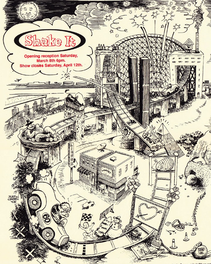
 Signed and dated limited edition silkscreen print from 2009 exhibition at Shake It Records in Cincinnati, Ohio. Edition of 100, 120 lb. creme stock, 18" X 24"
~~~~~~~~~~~~~~~~~~~~~~~~~~~
Image depicts the conventional holidays of the year as monuments flanking an eternal roller coaster. A more detailed view is shown in image below.
This poster is free to all who contribute $50 and more.


This is the cover of my infamous 1972 Underground Cartooning Course, the second "mini-comic" ever produced. This was done as a wake-up call to the Underground community, and an experiment in self-publishing utilizing the new Xerox machines which allowed for instant reductions. Its complete genesis is described in my Etsy store, ScribeArt. This is a sheet of 8 1/2" X l1" paper, quartered and stapled. I have about 50 left. They are available, signed, for donations of between $15 and $25.
Finally, I am offering one of my "Great Moments In Advertising" postcards (6" X 9") to all who donate between $5 and $15. This series was a promotion for Signs Of The Times magazine. Their advertising appears on the reverse side. Heavy, coated stock.

Sunday, May 11, 2014
Save The Bees Campaign (continued)
This is a limited edition of 100 letterpress prints produced by Milkfed Press of Alameda, CA
They are printed on 140 lb. matte stock, 7 3/4" x 10 1/4"
It is available through the Etsy site described in column at right...
It is available through the Etsy site described in column at right...
A written piece will follow when I edit this post. For now, here's the image:

Wednesday, April 23, 2014
Sublime Slapstick

She writes: I was struck by the last cell. You write: "Finally came the day when you brushed a perfect 2" O with a few deft strokes, though it seemed like a cataclysmic event, the world was strangely indifferent." The image shows the Sign Painter, thrown backwards by the "O", with just his legs visible. On the left, the man in the barber chair is saying, "Rugs in kitchens? Hmmph! I'm against it." The combination of the legs and the sentiment immediately made me think of Bruegel's painting "Landscape with the Fall of Icarus" and the W.H. Auden poem, "Musee des Beaux Arts", that makes reference to it. Do you know the painting/ poem?

In the painting Bruegel has depicted an unremarkable, quotidian scene—a farmer plowing, a shepherd tending his sheep, a ship sailing into harbor. In the bottom right corner, if you look closely, you see a pair of legs disappearing into the water—they echo yours exactly (or so I thought). Auden's poem:
About suffering they were never wrong,
The old Masters: how well they understood
Its human position: how it takes place
While someone else is eating or opening a window or just walking dully along;
How, when the aged are reverently, passionately waiting
For the miraculous birth, there always must be
Children who did not specially want it to happen, skating
On a pond at the edge of the wood:
They never forgot
That even the dreadful martyrdom must run its course
Anyhow in a corner, some untidy spot
Where the dogs go on with their doggy life and the torturer's horse
Scratches its innocent behind on a tree.
In Breugel's Icarus, for instance: how everything turns away
Quite leisurely from the disaster; the ploughman must
Have heard the splash, the forsaken cry,
But for him it was not an important failure; the sun shone
As it had to on the white legs disappearing into the green
Water, and the expensive delicate ship that must have seen
Something amazing, a boy falling out of the sky,
Had somewhere to get to and sailed calmly on.
 |
| Merrell Hambleton, Girl Friday, Icy Signs, Brooklyn |
Saturday, December 14, 2013
The Frugal Santa

Saturday, November 23, 2013

Sunday, October 6, 2013


Monday, August 12, 2013
SAVE THE BEES Campaign
 |
| Rough Sketch for T-Shirt Design done in Quill on Nexus 7 |
As cartoonists, we have the ability to tap into the collective psyche of our reader/viewers. Our unique talents can also be pressed into service for the greater social good (besides mere "self expression") when circumstances warrant it.
I hereby propose that we form an image bank of copyright-free designs that can be disseminated for the purpose of raising public awareness of the imminent catastrophe that our food supply will endure if this pandemic bee die-off continues.
 |
| Sign enamel on aluminum, 24" x 30", 10/13 |
Now that Colony Collapse Disorder is the current Time cover story, this sketch of mine, done in response to anti-GMO blogs several months ago, is very much mainstream. I would like all concerned cartoonists to send me a jpg as an attachment (lo-res please) of your custom design with the simple slogan:
SAVE THE BEES ~ ~ ~ ~ ~ ~ ~ ~ ~ ~ ~ ~ ~ ~ ~
justin.inknib@gmail.com
My next post will feature all designs received (and I'll make this one print-worthy). Include your contact info should a high-res version be needed. At that time I would hope that anyone with social networking skills will help send the images out to any potential sources that might fabricate posters, t-shirts, magnets, mugs, etc. If you have finished product, so much the better. Beyond mere sloganeering, there are many tangible things that individuals can do to fight this imminent agricultural catastrophe. Nobody is going to make money on this deal, but maybe we'll help in the effort to insure the future of the avocado. Plus almonds, apples, asparagus, broccoli, blueberries, onions, cucumbers, celery, plums, watermelons and tangerines. Despite the likelihood of massive crop failures, though, we could still be able to have peanut butter and jelly sandwiches. Rest assured that the humble peanut and grape may survive this blight without pollination.
Friday, July 19, 2013
S. CLAY WILSON UPDATE

The immortal Wilson will be 72 on 7/25. For those of you
unfamiliar with the history of comics, he is one of the original Zap
artists who stoked the Underground comics movement. Several years ago he had a near-death experience--a
traumatic brain injury--that left him in a severely diminished state.
His wife Lorraine Chamberblain has become his full time caregiver
despite her own medical issues, which are daunting. Her job description
during these difficult years includes not only the physical and
emotional work that must be done for Wilson's survival, but the
mind-numbing task of dealing with the state medical bureaucracy. Though
they live in a rent control apartment there are many other
expenses besides housing that must be covered. In a recent letter which I will paste
below, Lorraine mentions that "the trust fund is dismally low now, which
worries me a lot. It pays for some medical bills,
meds, the phone, cable, Internet and cleaning supplies & clothes,
etc. Way more going out than coming in."
By requesting that you contribute to his trust fund, I am challenging
the concept of free content, which seems to tbe main currency of the
internet. I will sweeten the deal by offering a FREE vintage 8-pager
(the second ever published, my 1972 "Underground Cartooning Course") as an incentive. Go on to my Etsy site ScribeArt
listed in the right column, and you'll see that it has a retail value of
$20. Either buy one and I will forward the funds to Lorraine, or send a
check to her directly and let me know. The check/m.o. should be made out toS. CLAY WILSON S.N.T. (special needs trust)
P. O. Box 14854
San Francisco, CA 94114
~~~~~~~~~~~~~~~~~~~~~~~~~~~~~~~~~~~
for Paypal contributions and further news, visit
www.sclaywilson.com
from Lorraine 7/17
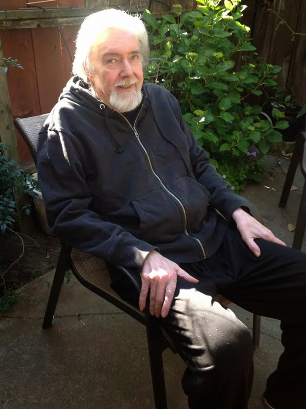
Here's a photo I took of him in the
back yard last week (shown above). It was a gorgeous day, and he was happy to sit and
watch the little girls from upstairs have a tea party while I repotted a
plant. We were out there for a couple of hours, and he smiled the whole
time. Today, however, he is extremely wobbly, and nearly fell over
twice on his way to the bathroom. He seems to be staring off, too, which
is worrisome. I'm calling his doctor, as the shunt in his brain may
need adjusting. Or maybe he is just a little tired today. I will make an
appointment for him to get checked out.
He hasn't been able to draw for a long time now. He can do nothing for himself. He watches movies. That's it. I try to keep him cheery and clean and feeling loved, but when I put drawing materials in front of him, he usually just looks at it. A few months ago, he drew what may have been clouds, or possibly talk bubbles for a cartoon. They were kind of close together, pointing every which way. He used a red pen. After a couple of hours I took it all away, as it was making him a bit sad.
He understands more than most people might think, but if a person talks too much, or changes the subject too fast, he gets confused. One time, when we were walking along outside, I had been blathering, and I asked him if he understood what I was saying, or did it just sound like "gobbledegook". He answered, "Gobbledegook". Disappointing to say the least! But I continue to talk to him throughout the day, telling him what I've been doing, where I went, etc. He likes the attention. When people visit him, if they just talk to him like they would anyone, he will often smile or give a belly laugh. So I know he gets a lot of it. If a visitor is uncomfortable and tongue-tied, he will just stare off and refuse to smile or respond. That has happened a few times, making an old friend feel even more uncomfortable. But they shouldn't take it personally. He can be really grumpy sometimes. You just never know.
I
encourage people to call him just to say hello and tell him what they're
up to. He can't really talk, but he
responds for a minute or two before handing me the phone. It always
makes him happy, even if it's just for a minute.
He has become pretty frail. It is really hard to get him to cooperate and walk with me around the apartment, much less out on the sidewalk. Outside, the sounds of the traffic or people walking past sometimes scares him. It is almost impossible to get him to walk for more than a few minutes. He will just sit down. I have to bring the wheelchair when we go outside, and he wants to sit in it after getting only as far as the corner. The sidewalks are uneven and very dangerous, so he could trip quite easily. There is just no way to keep his leg muscles strong! When I have him pedal on the machine, I have to sit in front of him and nag repeatedly, or he just stops. He only does it for a couple of minutes before he stops no matter how many times I remind him to pedal. You can see the dilemma. He is getting weaker and weaker as the months and years go by.
But he is
kind of happy a lot of the time. I spend a great deal of energy trying
to keep him feeling positive and cared for. I never want him to feel
lonely or sad. But of course, sometimes I want to just run into the
street, screaming, as anyone taking care of someone with dementia must
feel. A few months ago one time, when he'd made a terrible mess, I said
"If you are playing a practical joke here, it is the longest-running one
of all time and belongs in the Guiness Book of World Records!" He just
laughed, then looked confused. Of course he's not faking! But he used to
think other people, like his mother, (who died
of Altzheimers and failed to recognize him in the end), were.
I am becoming a little more crippled myself these days, as now my right hip is going. I can't put my own shoe & sock on, and often yell in sudden pain when I am walking or sitting down or lying down or standing up or just BEING...you get the idea. I can no longer go up stairs with my right leg at all. I need hip replacement, but just when I could arrange it is still a dilemma. I would have to put Wilson in the hospital. He is only allowed to be there for 30 days, or SSI will not send our checks. Then we would lose our apartment, as we're already living on pennies. So I'd have to bring him home within 3 weeks and start taking care of him again til midnight every day. It's difficult to take care of him with the back & hip pain I'm already in. Plus, I prefer to go see him every day when he's in a facility. He won't let anyone else touch him or give him his meds 4 times a day! So I have to go help. (Although sometimes the nurse will call and put him on the phone and I've been able to talk him in to cooperating). Oy vay....so much to consider!
I've invited some of his friends over for a little birthday party on Sunday, the 28th. The real day is the 25th, but that's a Thursday. I'll give him a little celebration on that day myself. So he gets two parties this year!
Saturday, June 29, 2013
New Wine/Old Bottle
In a nutshell, the "daily" format--consecutive panels in a rectangular
block--was traditionally a much denser visual artform than we see
today. As newspaper readership began to falter during the '80s, ad
revenues became critical for survival. So the generous scale allotted
to the standard daily strip was cut back. The reduced format made the
block--was traditionally a much denser visual artform than we see
today. As newspaper readership began to falter during the '80s, ad
revenues became critical for survival. So the generous scale allotted
to the standard daily strip was cut back. The reduced format made the
more detailed strips
difficult to read. There is a certain point at
which text becomes too small to read, so the balloon size had to
remain fairly close to its traditional scale while the art got reduced
to more basic elements. Through the mandate of their accounting
departments, newspapers gravitated to the modern version which
emphasizes writing over art. It is my hope that the digital age will
enable the pendulum to swing the other way.


In some recent experiments with this form I came to the realization
that the tablet format is becoming the most common way that news is
delivered. So why not comics, too?! By having a vertical division
exactly at midpoint, one can produce a two column strip that fills
exactly at midpoint, one can produce a two column strip that fills
the parameters of a standard tablet screen. Though my inked
strips are done the traditional way, I reformat them as digital art.
The trick is knowing when to use Photoshop as a finish tool, and most
difficult of all, when to leave it alone. The above first appeared at the
www.pengrenades.com site which I shared with Brian Hagen and Dan
Schubarth. This and other original inked strips are
now available on my Etsy site.
Saturday, June 1, 2013
A Brush With Death
Here's one from '05, ten years after the incident depicted--with very little artistic license.

Wednesday, April 17, 2013
Using A Tablet As A Lightbox

This is a departure from the usual posting of older work because this is the first piece in which I explore the potential of the tablet as a substitute for the old-fashioned light table. I use a humble Nexus 7, which only has a screen that measures 3.75" x 6". But that's enough to handle most single panel work.
I began the strip the usual way--with a series of disjointed little doodles, intelligible to nobody but myself. A basic continuity of ideas was determined, then the continuity got broken down into basic frames. After a motive was determined for each panel, the dialog suggested itself.
What is new about this strip is that once I had the basic poses conceived as stick figures, I drew directly on the tablet in a bare bones program called Quill. By toggling the scale and size of the scribing tools, I was able to arrive at poses that had the maximum dramatic effect, then finesse them to a degree that would have been very tough on the drawing paper had I used a pencil and resorted to several erasures.
The great thing about using a tablet program for doing roughs is that once you have arrived at the optimum sketch, you can tweak it to exactly the scale that you want by pinching the image. The one proviso here is that it only works with 1-ply (Strathmore 500 Bristol); also a thin piece of glass is needed to put over the tablet while the tracing is being done. Otherwise the tracing will toggle the image. Okay, there's one more annoying thing: you probably have to do this at night with all other lights off. But chances are, you're working at night already...
This method provides a seamless way of accessing imagery from the web, too. That Diogenes portrait I did at the top is a tracing two times removed from the excellent source material that I had. And that was only one of a dozen beautiful images that I could pick and choose from! I'm glad that I learned the traditional way, though; even this method depends on a tactile relationship with the drawing tool. I know this discovery is not for everybody. But before you reject it out of hand, I think it's worth a try.
Friday, March 1, 2013
Homestyle Bookburning

But neither lady was around to comfort me a couple decades later when I was provoked to the same level of terror by Cousin Billy's film, The Exorcist. By then, I'd learned to hide my emotional life from the general public, thanks to a raging case of OCD.
If you ever come across the watercolor drawing of this image, please contact me immediately with the details. It is stolen property. Thanks...
justin.inknib@gmail.com
Subscribe to:
Posts (Atom)